
Purdue IT
This project focuses on evaluating and optimizing a large interface upgrade for the Purdue Libraries’ search experience by Primo Next Discovery Experience. The goal is to assess how the new UI performs by evaluating features such as AI research assistants, enhanced user areas, and simplified request forms through user testing and UX auditing. This evaluation will uncover new opportunity areas and uncover points of confusion for users.
00

problem
Purdue is rolling out a redesigned UI for its library website and is conducting user testing to identify potential issues or frustrations. This process ensures that any problems are addressed before the updated site is released to the public.
solution
Assess how the new UI performs by evaluating features such as AI research assistants, enhanced user areas, and simplified request forms through user testing and UX auditing.
Project Overview
Background Information:
As the information hub for Purdue University, Purdue Libraries drive academic excellence by curating and providing equitable access to an expansive collection of diverse resources. Purdue Libraries’ mission is to enhance research, teaching, and learning through outstanding services, innovative physical and digital spaces, and advanced discovery systems that connect Purdue’s local, national, and international communities with the knowledge they need.
Project Goals and Outcomes:
Identify usability and accessibility issues on the current site, using heuristic evaluation and WCAG guidelines, prioritizing them by severity and ease of fix
Create specific, research-backed design recommendations for the search results page based on user testing and usability heuristics
Evaluate the current AI chatbot for ease of use, task completion rate, and efficiency through usability testing
Key Terms
Primo NDE: The vendor company that has a full template design of the new Purdue Library Search, the Next Discovery Experience
Sandbox: The inaccessible but live version of the redesigned Purdue Library Search
Problem
With Purdue pushing out a new and improved library website using Primo NDE, there were many areas in which we needed to research to ensure the search experience for users was intuitive, effective, and simple for users to understand.
Knowing this information, this project focused mostly on user testing, accessibility, and recommendations for the final product.
Research - Insights
UX Audit
Goal:
Complete a heuristic analysis of Purdue Library Search using common Purdue search tasks, documenting usability issues, and identifying user flows to guide our user testing.
Approach:
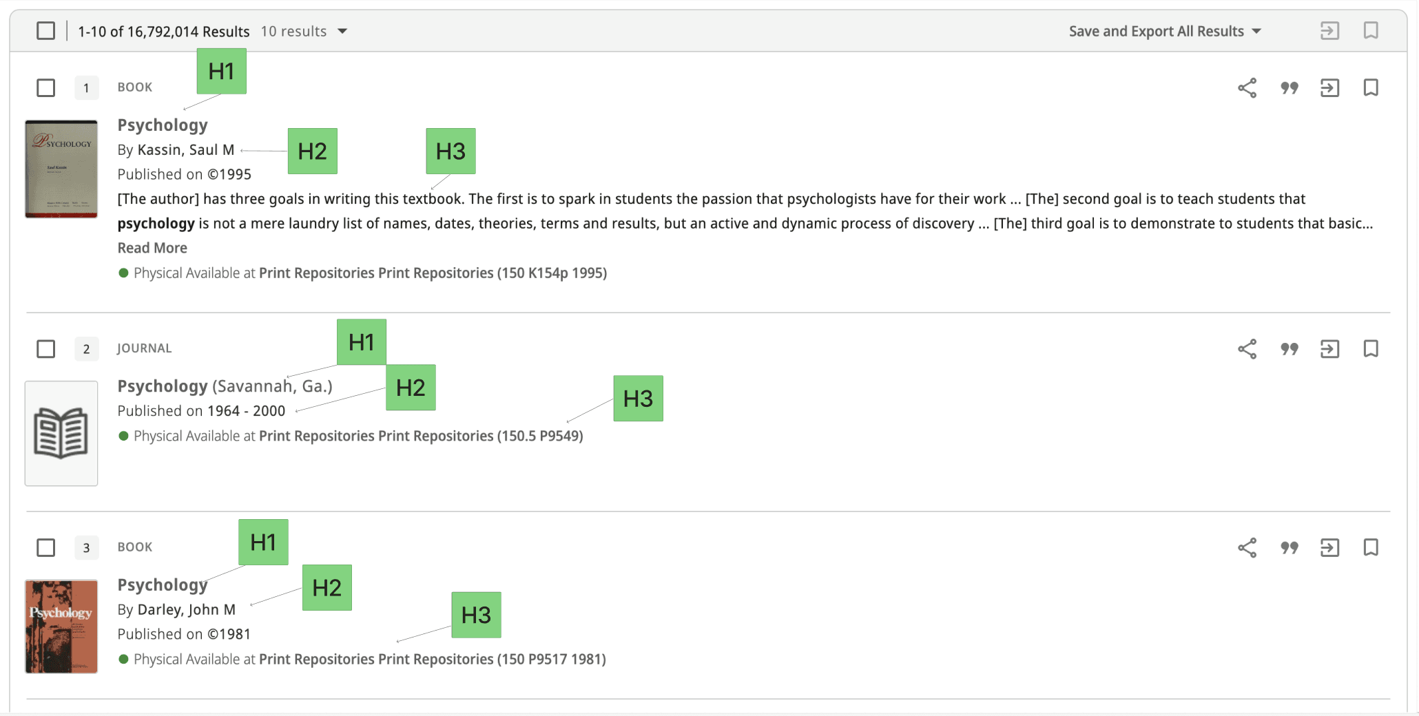
To conduct this audit, we looked at two areas being the landing page of Purdue's library website in addition to the general search results page.
Things we immediately noticed that caused issues were:
Window sizing errors depending on the user's display
Nav buttons are overlapping, causing difficulty clicking on links

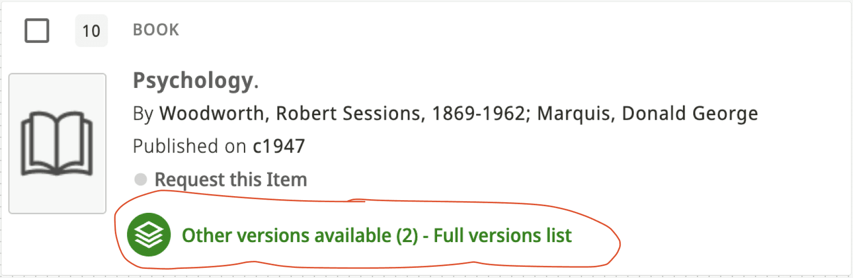
Unrelated sources are presented top the user if switching off "relevance" on the "sort by" tool
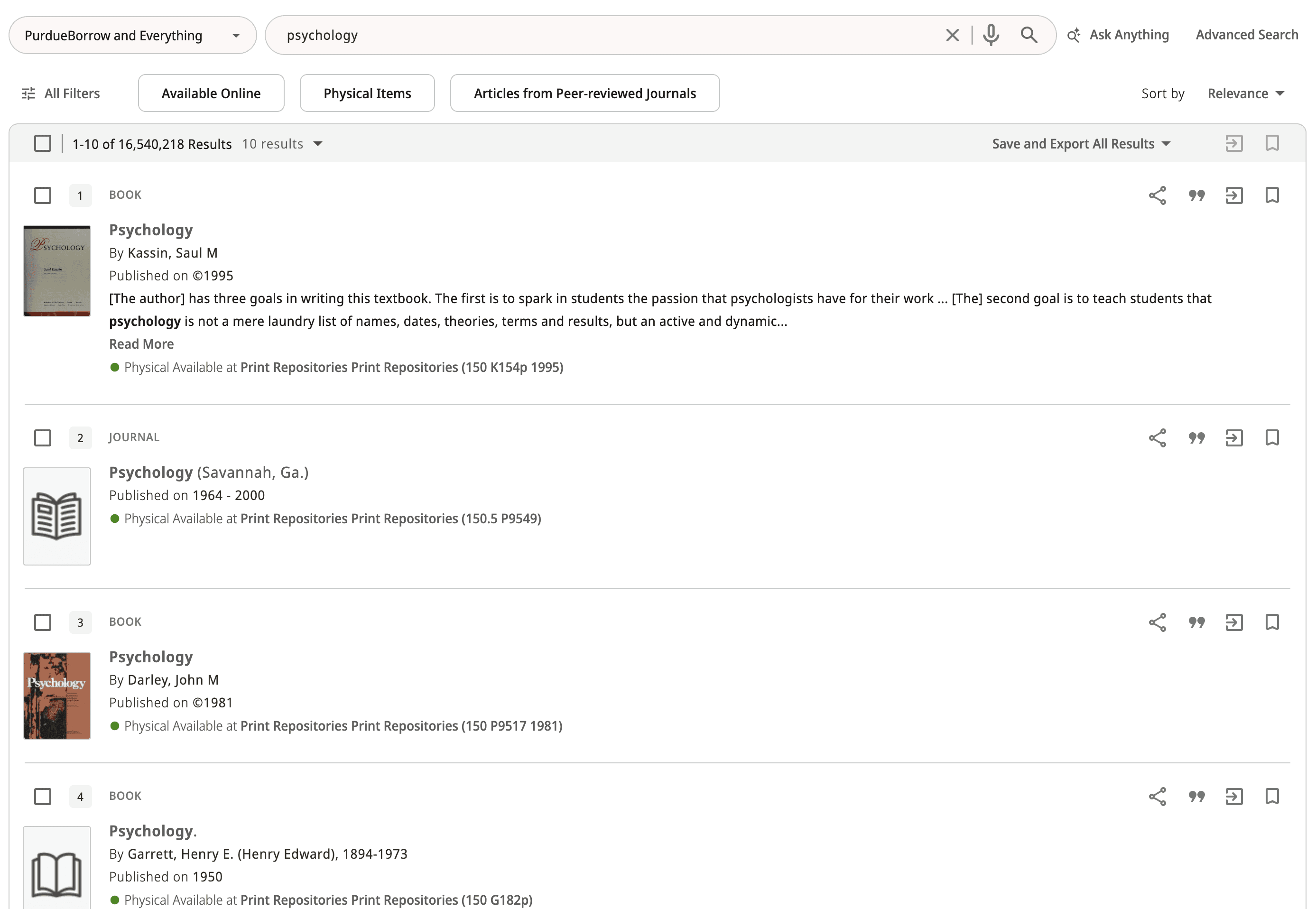
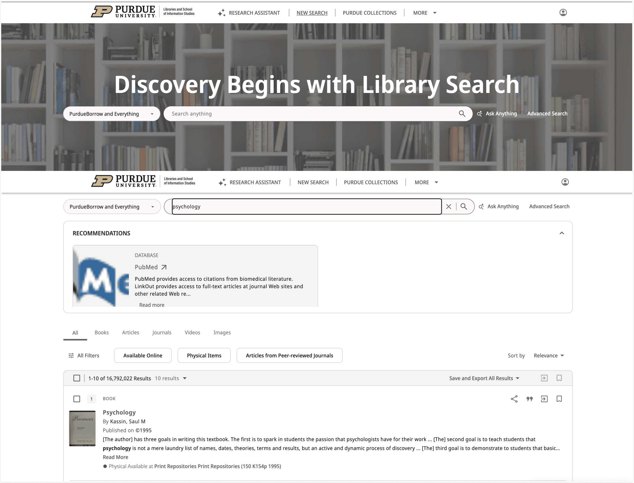
Fig. 1: Psychology Search sorted by “Relevance”
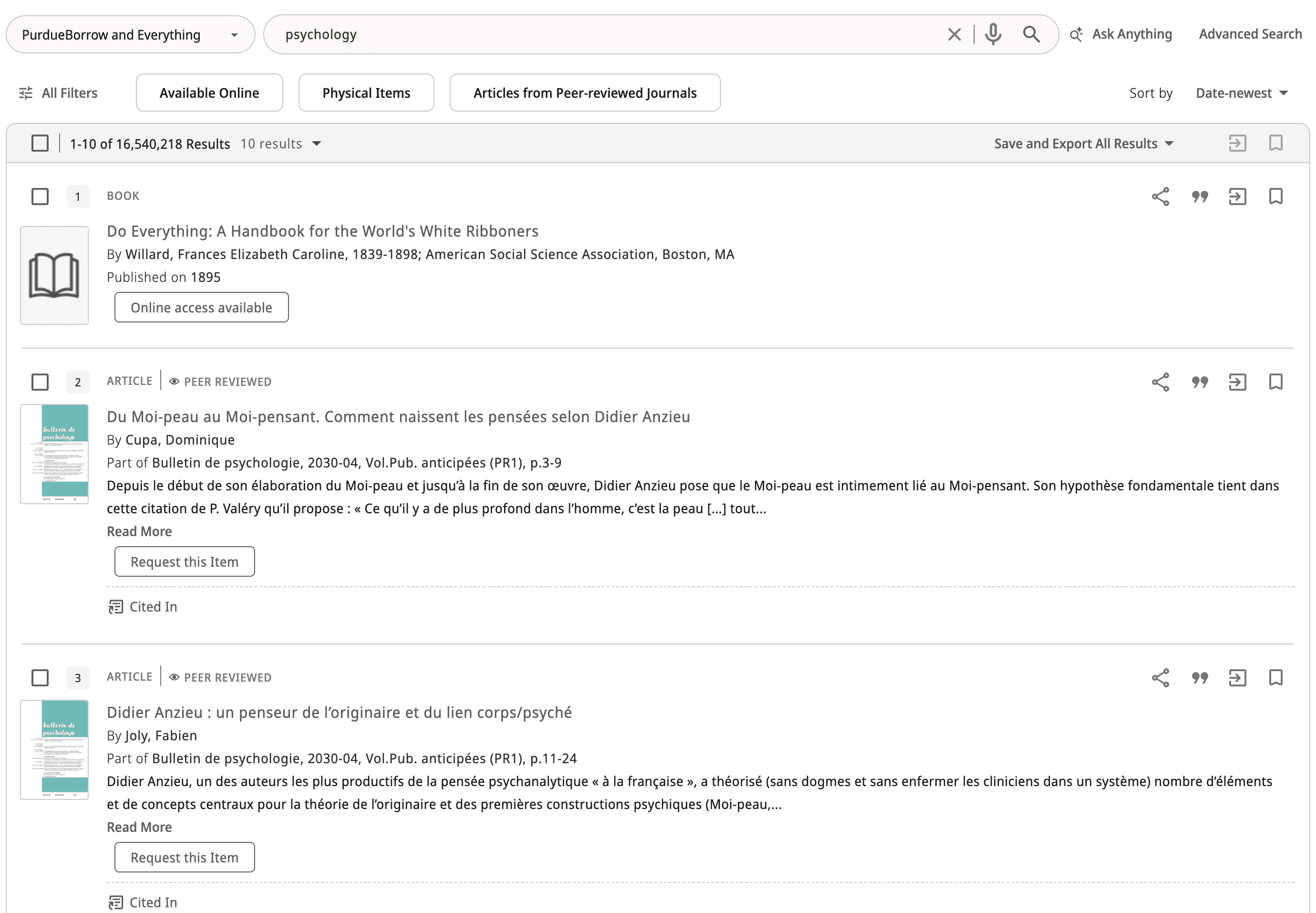
Fig. 2: Psychology Search sorted by “Date-newest”
User Testing
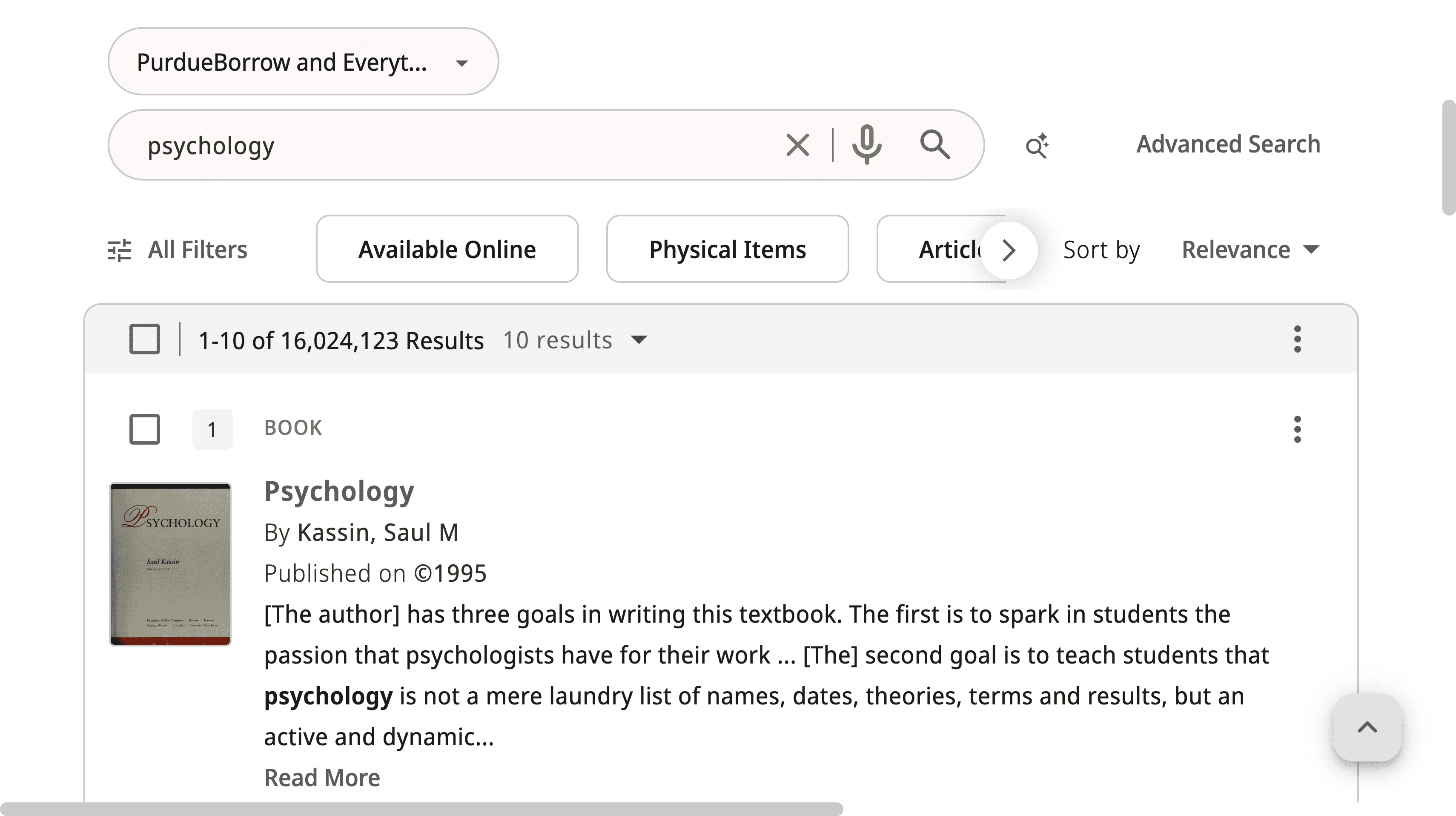
General Search
Goal:
Test how users actually use the Purdue Library Search and understand what feels easy vs confusing. We wanted to see how people search on their own, what they notice first, and where they get stuck, especially with filters, labels, and navigation.
Approach:
We conducted moderated user testing using both unguided and guided tasks. We started with an unguided portion so users could search naturally, and we could observe their real behavior and first impressions without giving them too much direction. For the guided portion, we chose specific actions based on the usability gaps we identified through our heuristic analysis and UX audit.
AI Features
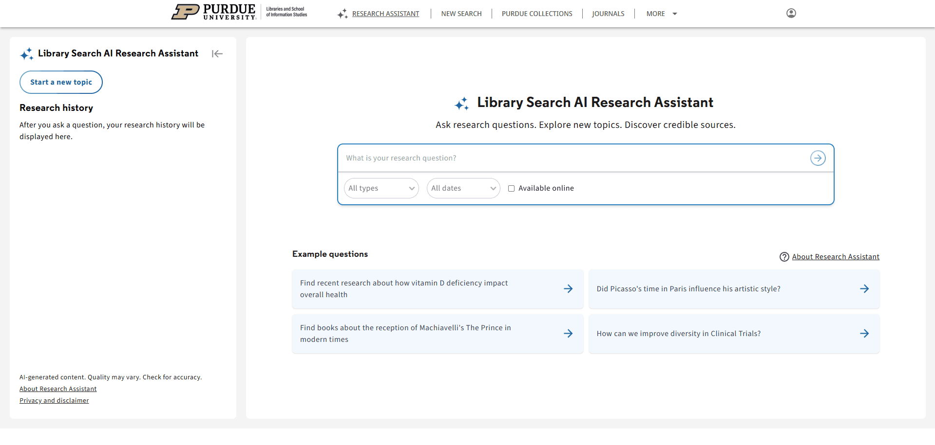
Goal:
Test how users actually use the AI features; Research Assistant and Ask Anything. We want to find what is easy or confusing to use within each tool, and if the tools do what the users expect them to.
Approach:
We designed a protocol to test the Research Assistant and Ask Anything tools, and conducted 12 testing sessions with Purdue undergraduate students. Prior to administering the prompts, we gathered insight on users’ initial assumptions of what each AI tool did to determine if the terminology was misleading.
Accessibility Audit
This Accessibility Audit was conducted in order to ensure the Purdue Libraries website meet WCAG 2.1 accessibility standards by April 24, 2026. We first had to research all the requirements that each website must meet being WCAG, ADA, and VPAT. The one that we had to put our focus on was WCAG, as it had two levels to its requirements, POUR and the Conformance Levels, which the requirements fall under.
Upon doing research, we prioritized our time on researching WCAG because under WCAG was where the required standards which websites must meet fall under. ADA and VPAT were not as important to focus on in this audit.
Research - Synthesized Findings
UX Audit
The audit revealed critical usability gaps in three areas: layout stability, navigation clarity, and result refinement behavior.
First, the interface showed layout stability issues across screen sizes. Header and navigation elements overlapped on certain resolutions, which made key links harder to click. We also observed unexpected horizontal scrolling, which created an inconsistent scrolling experience and made the page harder to scan.
Second, the search experience showed result refinement issues that could reduce trust in the system. When users changed “Sort by” to options other than Relevance, the results often drifted away from the original query instead of staying on-topic. In addition, applying some filters still produced inconsistent results, even when the filter selection was clear.
Some fixes may require vendor-side changes through Primo, but documenting these issues is still important. It gives Purdue Libraries clear, specific evidence of what is breaking in real use and what should be prioritized or escalated.
User Testing
General Search - 1st Round
Takeaways:
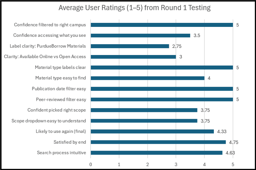
After completing this activity, we saw that most users could start searching quickly and finish the core tasks without much trouble. Nearly everyone went straight to the main search bar, and most felt the results were generally relevant and easy to scan at a high level. Users also found the peer-reviewed and publication date filters straightforward to locate and use, and several rated these steps very highly.
At the same time, a few confusion points showed up across participants, mainly tied to labels and “what does this mean before I click.” such as:
PurdueBorrow Materials: Participants described it as: “resources available on each of the campuses,” a campus location filter, or even “something owned/published by Purdue,” and several rated the label clarity low because it felt unfamiliar and hard to predict without clicking.
Available Online and Open Access
Some participants assumed Available Online meant “one click, and it’s free/accessible right now,” while others assumed Open Access meant “free to access and download a PDF.”
General Search - 2nd Round
After conducting our first round of user interviews, we found there were some issues in our first protocol , so we revised it to more naturally encapsulate the user's flow and experience.
Takeaways:
A lot of the feedback on this second round of user testing encompassed usability issues with some aspects of the site, namely, physical book request features and terminology.
Overall, a variety of users said the website and filtering process were intuitive, with some confusion regarding terminology and placement. This data allowed us to understand the struggles of what a first-time user would experience.
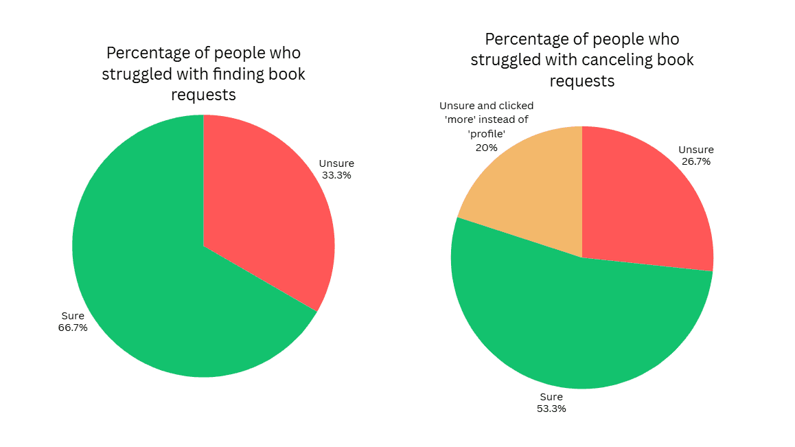
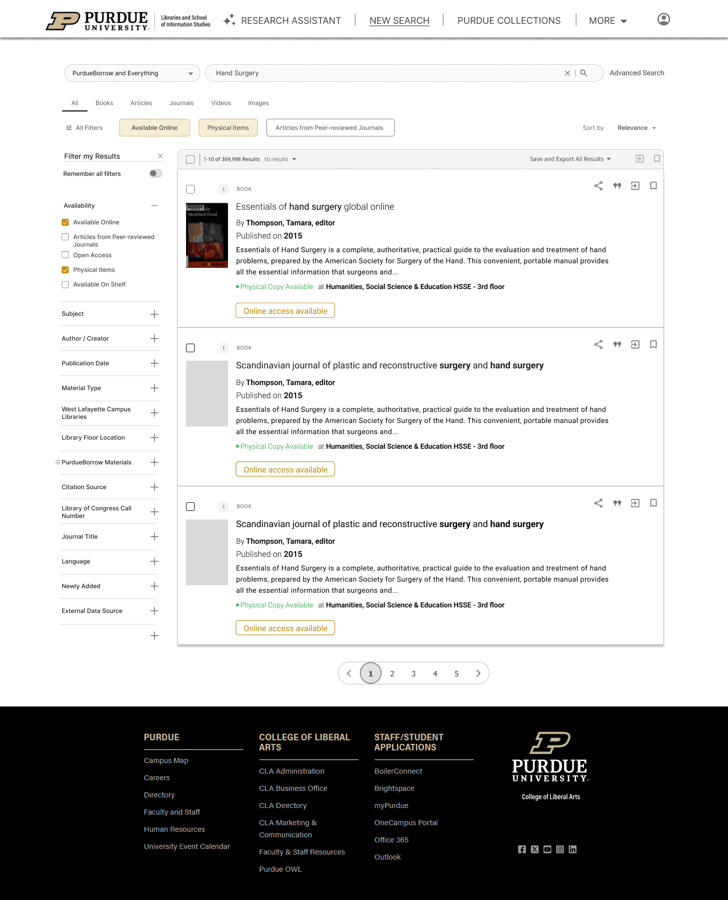
During the task of requesting a book and then canceling it, we found that many users had trouble with one or both tasks. Of our AI user tests, 5/15 users struggled to find the request button and were scrolling up and down on the page for a while.
We noted more confusion regarding canceling a book compared to requesting a book, as 7/15 users struggled to find the cancel request feature on the site. Another trend we observed during this process was that 3/7 users who struggled with finding the cancel option clicked on the “More” dropdown in the header instead of clicking on the profile icon in their search for the feature.
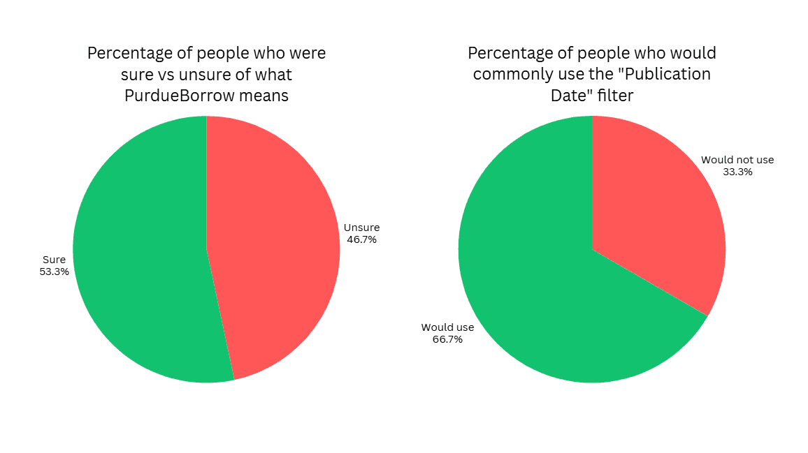
There are a lot of filters available on the Purdue Library Search, and we wanted to find which filters were helpful/unhelpful or confusing/clear. We found that 7/15 users had no idea what the term PurdueBorrow means, and then said they would not use that filter to help with their search due to the confusion.
We asked users which filters are most helpful when searching and which ones they would use most commonly when conducting searches. Publication Date stood out as one of the most commonly used filters, with 10/15 people saying they would use it regularly when searching.
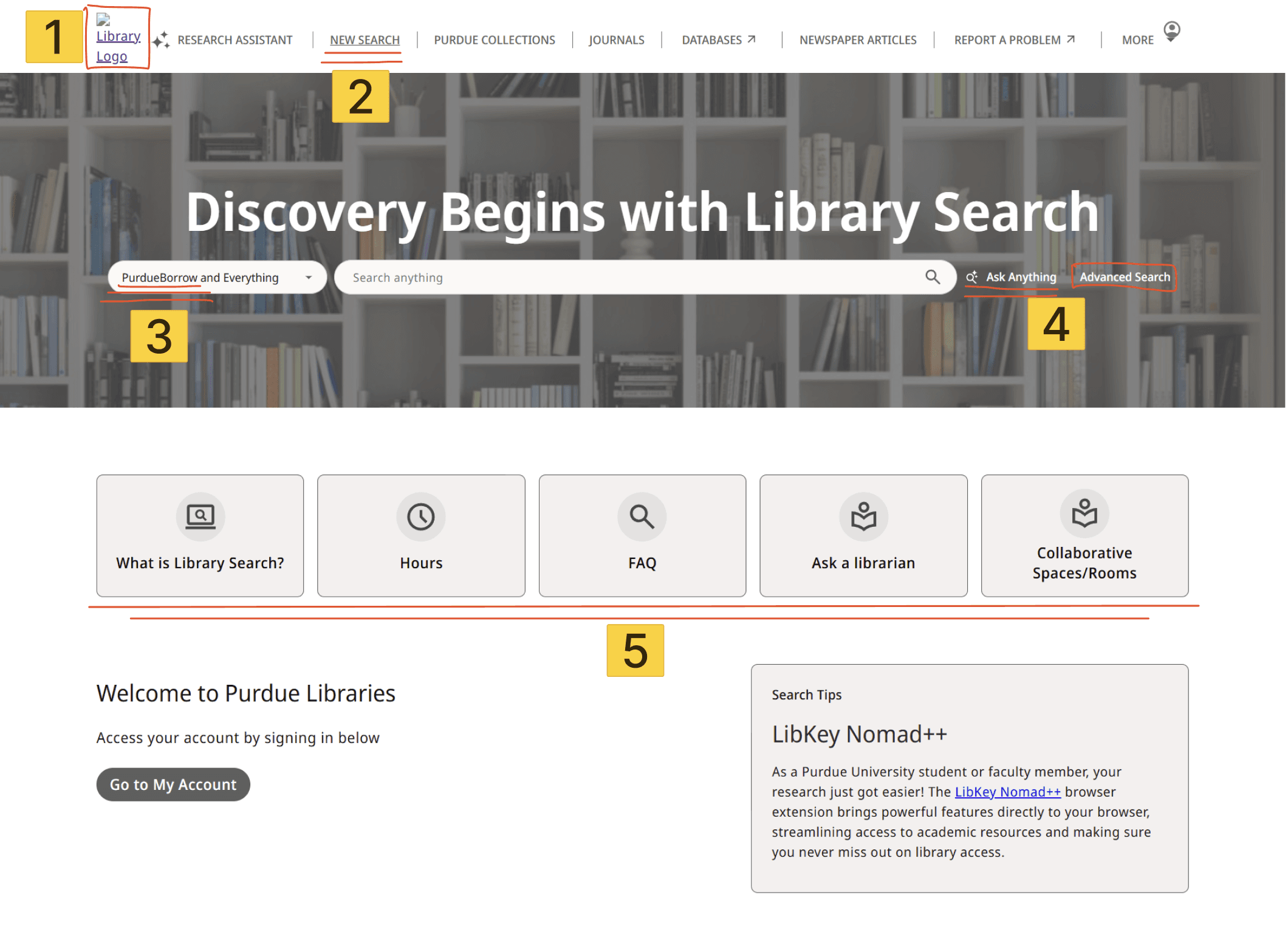
Users were unsure where the Purdue Logo Homepage would take them, and were confused when it removed them from the library search
The terminology “New Search” was unclear to many users
Users were a little uncertain about the terms “PurdueBorrow and Everything”. Most users just assumed, “It lets me borrow something from Purdue?”
The ask anything and advanced search were confusing implementations for the user, and the names confused them. “Ask Anything” implies that the user can ask any question in plain English, but many users found difficulty in getting the tool to work correctly.
Users were glad that the most essential parts of the website were available immediately with minimal touchpoints, but the iconography and graphics could be aligned more with Purdue’s branding, along with clearer button visuals
AI Features
Our UX audit and heuristic analysis highlighted likely problem areas, and we found that there might be hesitancy for using AI tools that users have never seen before. We designed the user testing protocol around those same areas to gather users’ thoughts and experience using the AI tools to see if it matched our expectations from research.
Takeaways:
The Research Assistant AI tool received a lot of positive feedback from users. Many said they had little to no issues with the process; however, many users were confused or unsatisfied when using the Ask Anything AI tool, as they were not able to determine the difference between Ask Anything and Normal Search.
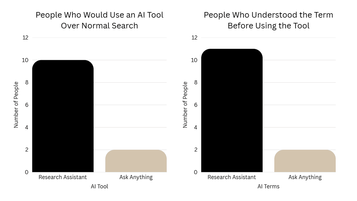
The graph on the left shows that 10/12 users said they would prefer to use the Research Assistant AI tool over the Normal Search, while only 2/12 users said they would use the Ask Anything AI tool over Normal Search. From the data we gathered by asking this question, the order of preference for search tools is as follows:
Research Assistant
General/Normal Search
Ask Anything
The graph on the right shows the confusion users had when trying to figure out what the AI tools were going to do on the page.
Some users explicitly said that they identified the symbol next to “Research Assistant” and recognized it as AI.
As for the Ask Anything AI tool, many users were immediately confused by the name. Users expected it to work like a chatbot or be significantly distinguished from the normal search. Our protocol included a question asking users how this differed from normal search, and most users could not provide an explanation for how the normal search and Ask Anything were different.
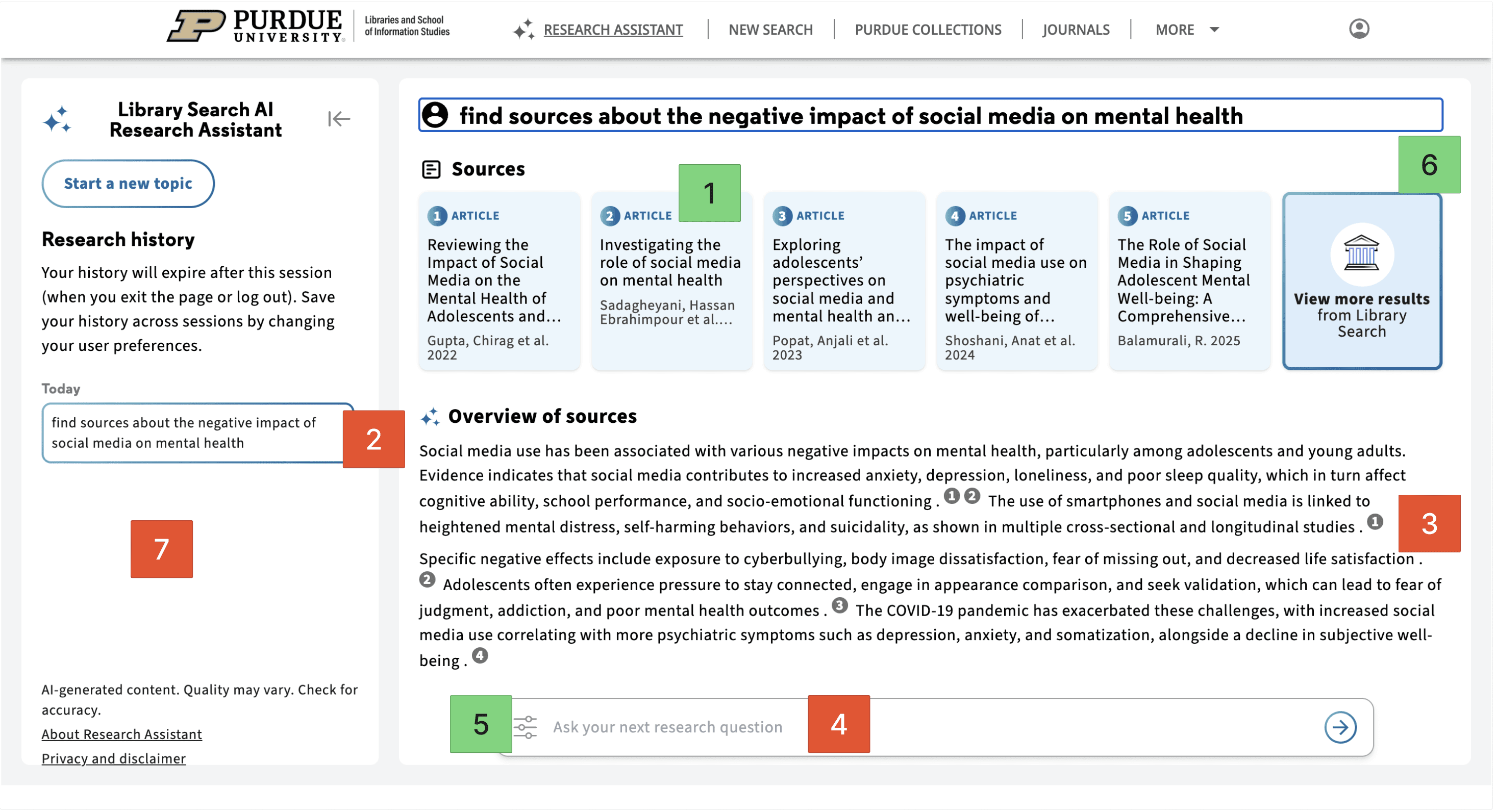
People liked that this feature showed source cards before the summary.
People disliked that the feature didn’t feel conversational enough compared to tools like ChatGPT or Gemini.
Users were confused about the numbers embedded in the overview and did not connect them to the sources listed above.
People disliked that they couldn’t easily edit or add to the original prompt.
Users liked the “type” and “date” filters that helped them specify certain criteria for their search results.
People liked that this feature narrowed down sources faster than a normal search.
People disliked that there was no strong search history.
Overall, Research Assistant came across as the stronger of the two AI features. A lot of users liked that it helped them narrow down sources faster than a normal search and that it showed the actual articles right away instead of only giving an AI-written response. At the same time, people still wanted a little more control.
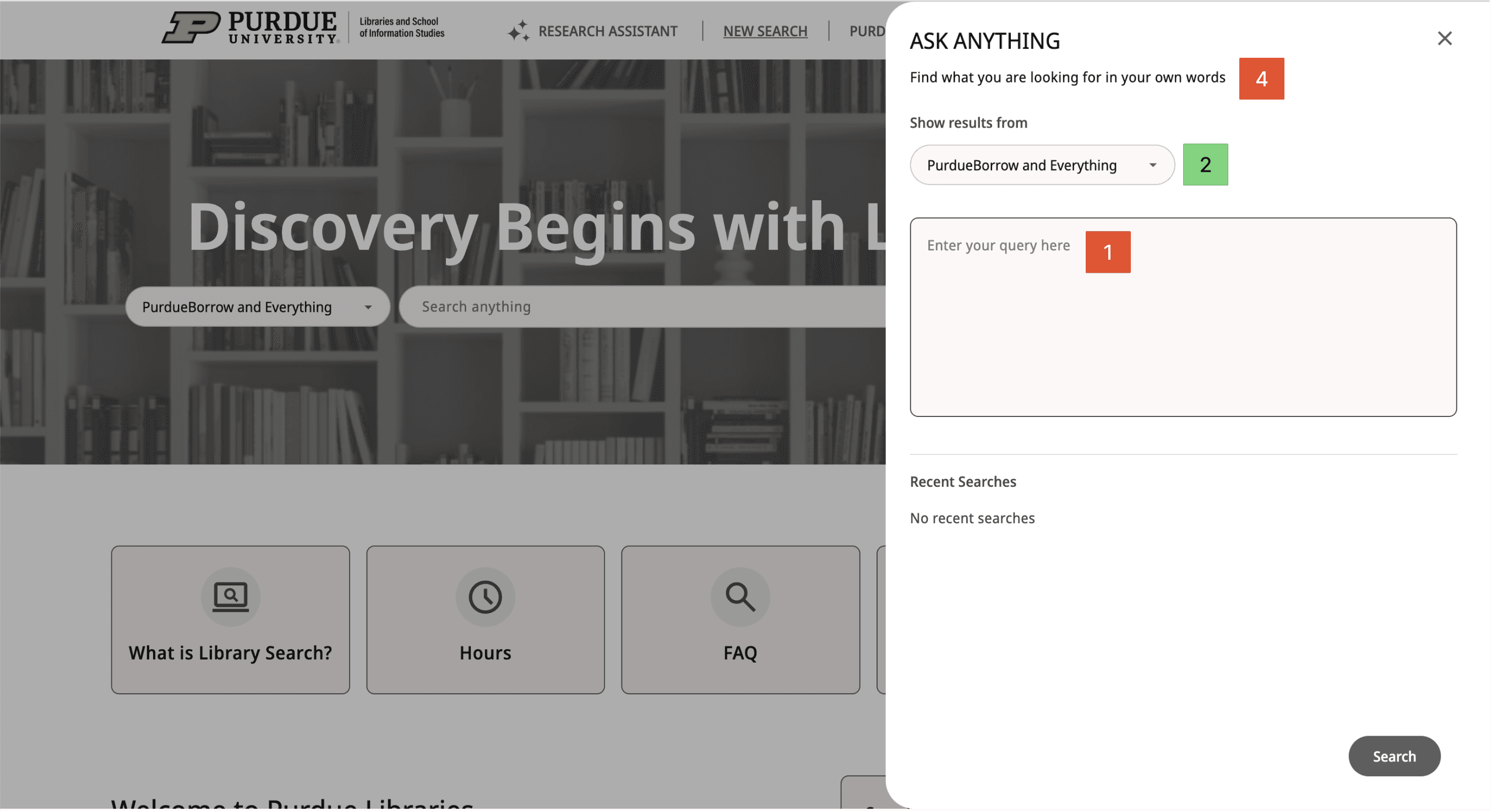
Most users interpreted this tool as more of a chatbot instead of another version of an advanced search and typed in queries as if they were talking to a chatbot.
Some users utilized this filter to help specify what type of source they were looking for.
People disliked that this feature felt too similar to normal search.
People felt that this feature was not conversational enough for something called “Ask Anything.”
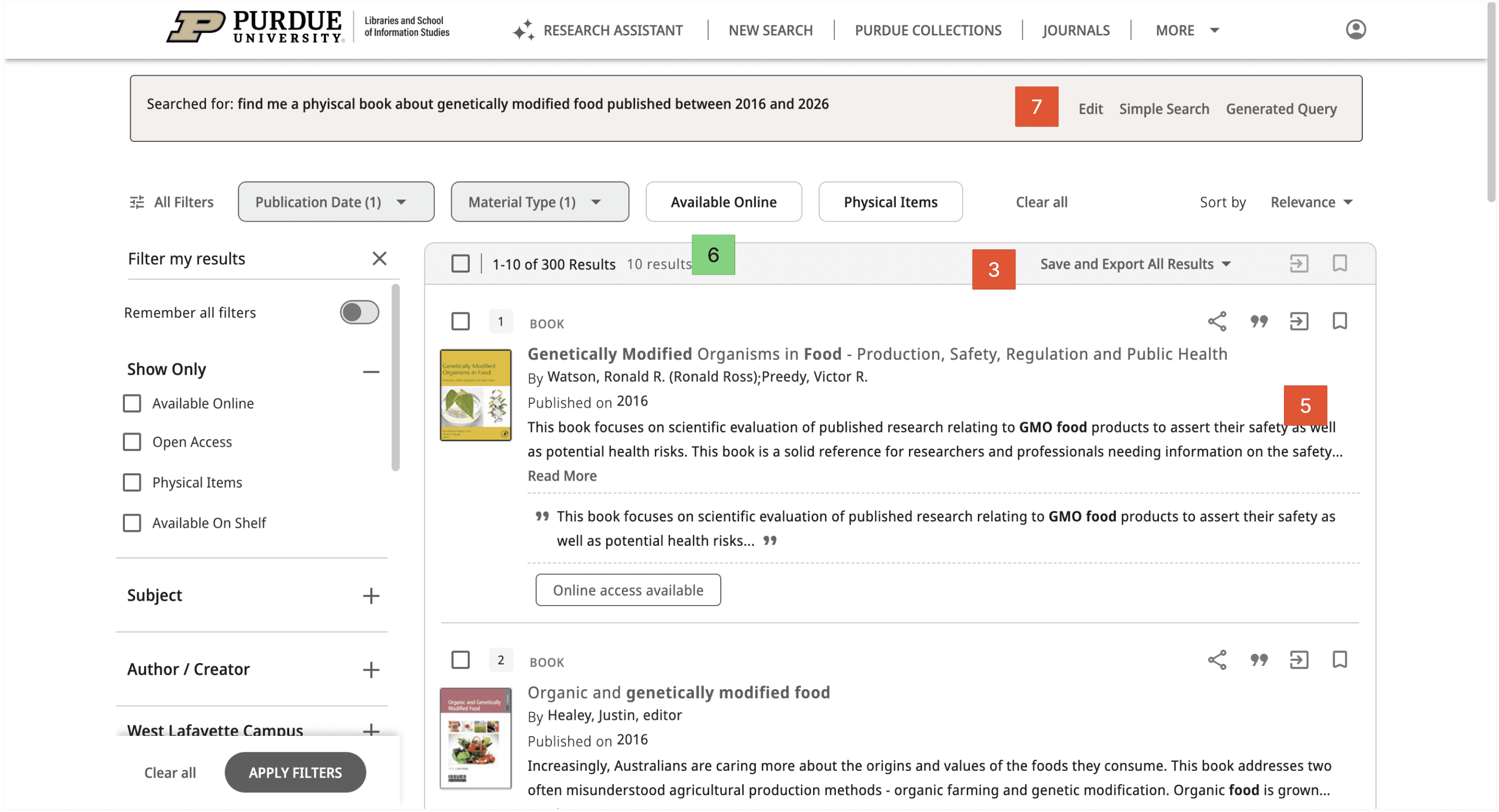
People disliked that the results could feel mixed or out of order.
People liked that this feature was broader and more exploratory.
Some users expected to be able to edit their search by simply clicking back into the search bar, so having to click a separate “Edit” button first felt less intuitive
Ask Anything got a much more mixed reaction. Some users liked that it felt broader and more exploratory, especially if they were not fully sure what to search yet. But a lot of people were confused about how it was actually different from a normal search. The name also made several users expect something more like a chatbot, so when it worked more like a search tool, that created some confusion.
Accessibility Audit
WCAG is rooted in two principals being POUR (Perceivable, Observable, Understandable, Robust) and Conformance Levels A, AA, AAA. This audit only focused on a couple of the requirements for Conformance Levels A, and AA due to the sake of time for the project.
Examples for Compliance Level: A
“Content must be structured using proper HTML so relationships are clear.”
“Content must be presented in a meaningful and logical order.”
“Color must not be the only way to convey information.”
“All functionality must be available using a keyboard. This helps users who can’t use a mouse.”
Examples for Compliance Level: AA
“Text can be resized to 200% without loss of content or function.”
“Your website must be responsive.”
“If using tooltips or title tips, it must be dismissible, hoverable, and persistent.”
“Navigation menus must appear in the same order across pages.”
Final Designs + Recommendations
This was the final phase of our project and the purpose of this concluding phase was to create designs + recommendations that would benefit the search experience for navigating Purdue Libraries. These designs + recommendations were centered around finding found in the Audit, User Testing and Accessibility Audit which gave us some great insights in what to change.
General Search Recommendations
Overall, our final recommendations focus on helping students use Purdue Library Search with less guessing and more confidence.
For terminology, we recommend adding an information icon next to PurdueBorrow Materials so users can quickly understand what the filter means without changing the current label or layout.
For filter organization, we recommend moving Publication Date higher in the sidebar because it was one of the most useful filters in testing, with 10 out of 15 users saying they would use it often.
We also included recommendations for the results page and request flow. Making book titles bold and black would create a stronger visual hierarchy, helping users scan results more easily and separate the title from the author and description text.
AI Recommendations
For our AI recommendations, we focused on keeping the main experience but improving parts that feel less clear.
For 'Research Assistant' we recommended to keep the main experience but imp-rove on parts that felt less clear.
Making summaries easier to scan, showing connection between the summary and sources, letting users edit their prompt.
For 'Ask Anything' we recommended removing it as a separate AI feature. This was because users were unsure how it was different from a normal search, and with the naming convention users expected something more conversational.
year
2026
timeframe
January 2026 - April 2026
tools
Figjam, User Testing, Auditing
category
UI/UX
01

02

03

04

see also


