DonateEquity
DonateEquity is a platform that aims to assist Nonprofits in accepting private equity donations from donors; looking to streamline the process making it more accessible for Nonprofits.
00

problem
DonateEquity is working on building an intuitive platform. However, with a limited number of users, they need to know “if their service fits into their stakeholders current workflow and whether or not it is intuitive for them to use.”
solution
Through ideating by sketches we worked towards the goal of visualizing solutions which summarize our research. These sketches drive our project towards the finish line as they are connecting everything we have gleaned from interviews, cognitive walkthroughs, and user testing into ideas for our finalized deliverables.
Process
User Flows:
Our first step was to understand the user flow of the current DonateEquity site before conducting our interviews with Nonprofits and Community Foundations. This step was vital because it allowed us to understand the pain points on the current website.
Having access to the platform's user roles, we completed cognitive walkthroughs understanding the different user flows of the different user roles.
These flows were:
Donors
Nonprofits
Appraisers
Community Foundations
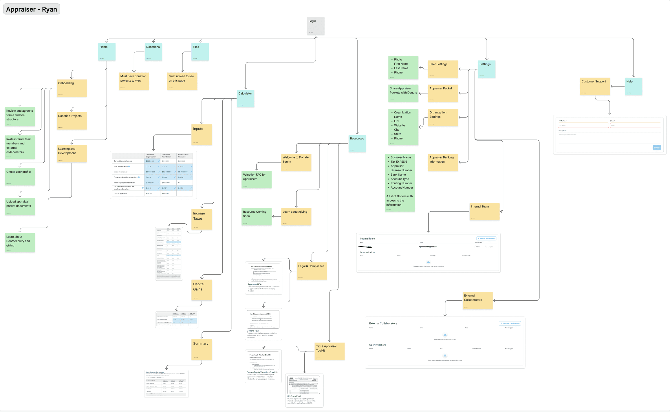
We determined that each role had some differences in the user flow, but also had some similarities. I was responsible for completing the user flow for the "Appraiser" role as displayed above. We determined that each flow was unique in the steps a single user could take depending on what role they signed up as, this included things such as Home, Donations, Files, Calculator, Resources, Settings or Help Page.
User Testing
Now that we understood the internals of the user flow, we were able to create a protocol with questions centered around the user experience which we asked our users.
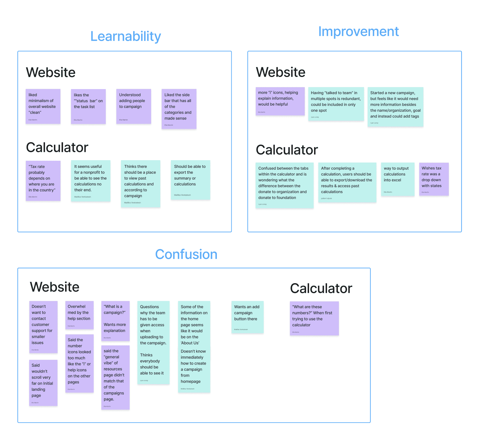
Based off our feedback, we separated them into three different categories being Learnability, Improvement, and Confusion. These three categories are what most of the user feedback fell within which gave us certain insights in different areas of the site.
Interviews
Each member of the team conducted their own interviews with different people from Nonprofits and Community Foundations. I took the lead interviewing the Planned and Major Gifts Officer at the Indianapolis Zoo and they provided great insights that helped us understand the current donation process.
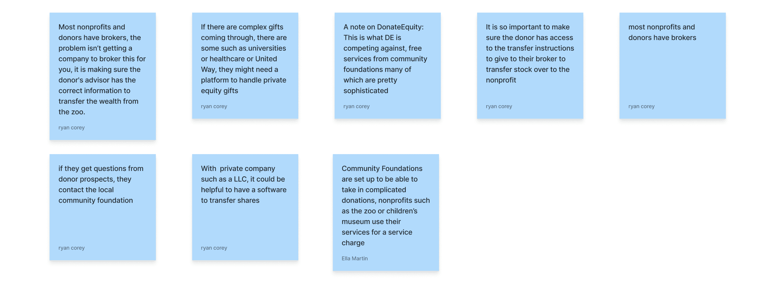
Their feedback encompassed thing such as how the donation process is information-heavy, brokers playing a central role, the difference between Nonprofits and Community Foundations, and the lack of clear transfer guidance.
After putting together our data from the interviews, we separated them into two areas; Existing Donation Process, and the current state of DonateEquity.
Existing Donation Process:
Many nonprofits and community foundations currently have their own donation process and software that works for them since there is a large variety of donation gifts that they accept
There are other platforms that are doing something similar to DonateEquity, specifically like Daffy, but their target user groups lean more toward primarily donors.
Donors sometimes give specific instructions to financial advisors and managers of their funds on how they want the money to be donated or promised.
DonateEquity:
A main point highlighted is that DonateEquity would be directly competing against free services offered by community foundations
DonateEquity should be highlighting what makes it different and unique, and how it offers to streamline the donation process.
Interviewees felt as though there was a surplus of content on the landing page and the information present was not hierarchically organized by importance.
Prioritization Matrix
Knowing what potential users may want with a service like this, we created a table grouping our insights from our user testing and interviews. The data found within this table was insights that came up multiple times within these activities. We distributed our insights into four categories being: "What works, needs to improve, questions, and suggestions".
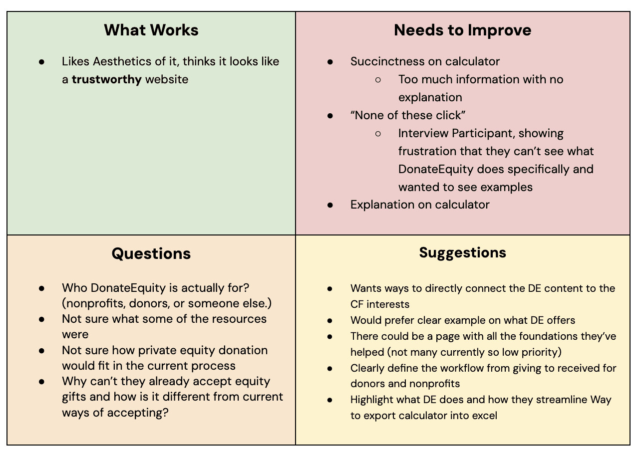
After completion, we went back through and discussed areas we wanted to focus on that had the highest impact. Such as:
Highlighting DonateEquity's unique benefit for each nonprofits, donors, and financial advisors specifically, including examples
Clearly define the workflows
Clear examples on what DonateEquity offers
With these areas in mind, we finished off by implementing our design decisions through sketching to create a new design for the website aiming to bring more users in.
Sketching
Through ideating through sketches, we worked towards the goal of visualizing solutions which summarized our research.
The team created their own sketches focusing on points of frustration found within the data collected previously through other activities where we would come together merging our ideas later in our Low-Fi Designs.
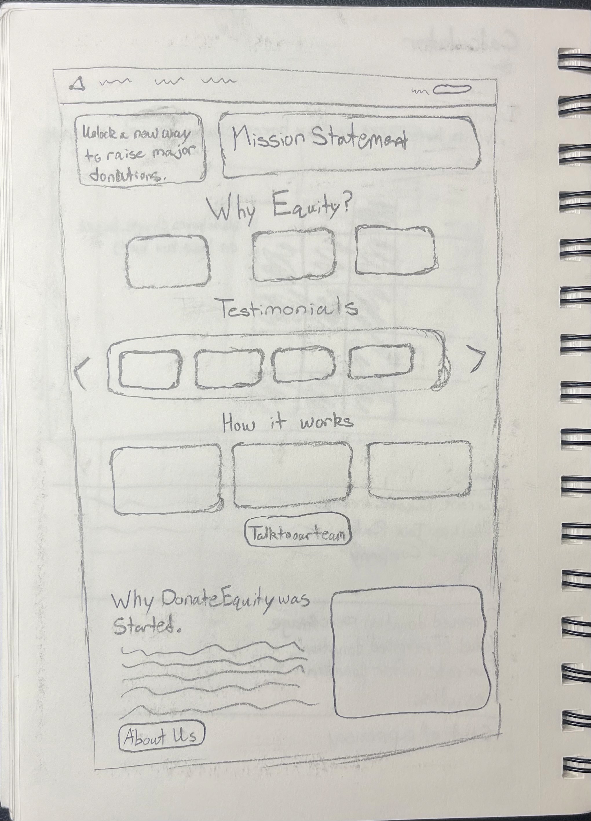
For my design, I focused on coming up with new solutions for the home page. My design focused mostly on the readjustment of aspects the old site didn't have. I was thinking more of a user friendly entry to the site where the first thing they see is what DonateEquity is and their mission statement.
Following the mission statement, I felt it was important to provide the "Why Equity" section towards the top because the older site had it much further down which would cause frustration and less engagement.
Finally, the "How it works" section provides the user with the entire process of how this platform works which previously like the "Why Equity" was further down.
Low-Fi Designs
After completing the sketch, I went into Figma where I built it to the best representation keeping all features and aspects.
When the team was finished with their designs, we came together where we refined our designs incorporating ideas found all throughout.
Final Designs
For these final designs, we focused on two main areas:
Main Landing Page
Individual Role Landing Pages
The team split into two teams, each focusing on both areas where we collaborated, designed, and finalized our designs until they met our expectations.
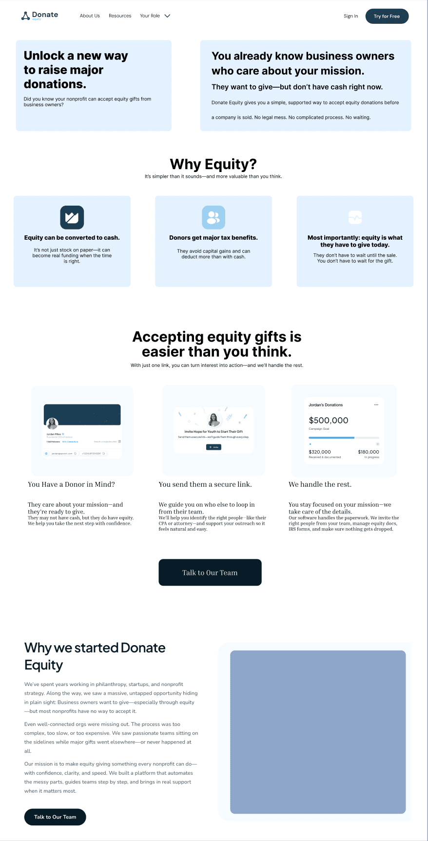
Main Landing Page
One of the main things we noticed about the Landing Page from both individual observation, and interviews was there was too much information on the page. This created the problem of confusion for first time viewers of the site. So we condensed down the Landing Page so users wouldn't be confused, but still had the information they needed.
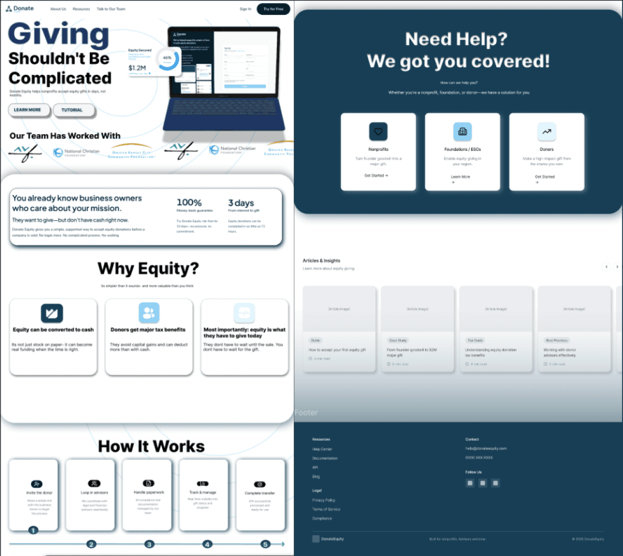
Individual Role Landing Pages
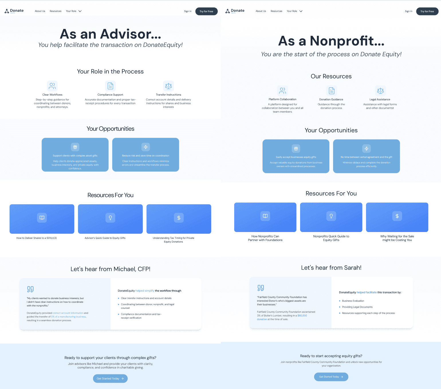
On the current DonateEquity, there was no specific place that a potential user could go such as a Nonprofit to see the benefits of using this service and how DonateEquity can help them. So we spent some time creating these pages which could serve as an anchor for these Roles looking to use this service.
Conclusion
The final designs serve their own purpose at helping the user understand the process of how DonateEquity can help. The Landing Page providing a place the user can navigate to understand the mechanics of the platform before deciding to use it, and the Individual Role Pages that provides the user signing into their desired role with the information they can use.
year
2025
timeframe
August 2025 - December 2025
tools
Figma, Figjam, Sketching
category
Branding and Identity
see also


